Crafting a Captivating League Shirt: A Thoughtful Design Endeavor
Project Overview
Approaching the design for this league shirt, my considerations were guided by a strategic approach to maximize its impact:
• Recognizing the shirt's potential as a powerful advertising tool for the league, I aimed to resonate with players they'd wear it beyond game days, attracting new members.
• I incorporated local significance to make the design appealing, positioning the shirt as a souvenir for those visiting Maine during the summer.
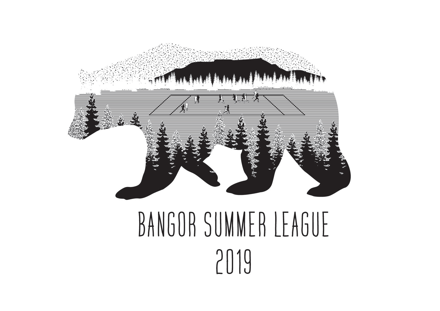
• Addressing the constraint of a single-color print by using texture and lines to add depth and details.
• Aligning the design with the league's emphasis on friendly play rather than intense competition.
Design Inspiration
Capitalizing on Maine's pristine nature, the design sought to encapsulate the state's charm. It prominently features trees and the silhouette of Mt. Katahdin, aiming to evoke the unspoiled beauty that draws people to Maine.
Design Decisions
Despite the diminutive size of players on the ultimate field, the design ensures the sport remains recognizable through the distinctive field shape and player positioning. The chosen font is friendly and approachable, in line with the league's beginner-friendly mission. Utilizing a single color, I implemented texture and lines to create a visually rich, multi-layered image.
This project showcases aligning aesthetics with the league's values and objectives.