Experiments into how maps can show user's orientation cues to be used for navigation.
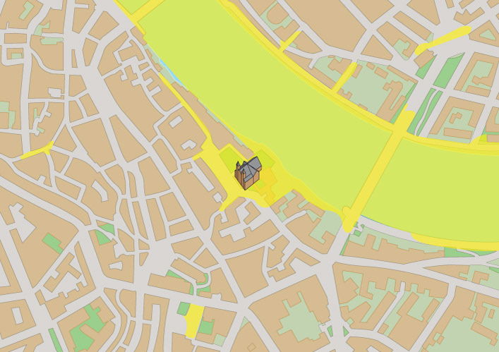
Adding a overlay of a color to represent locations that a landmark can be seen from could provide an interesting representation of the city.
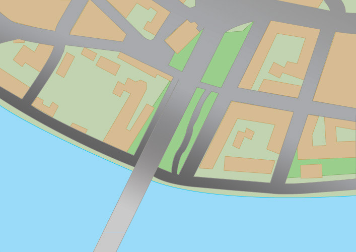
Adding a gradient to the gray of roads indicates inclines and declines.
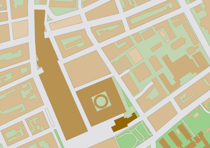
Having variable shades of the building color can represent the height of the buildings.
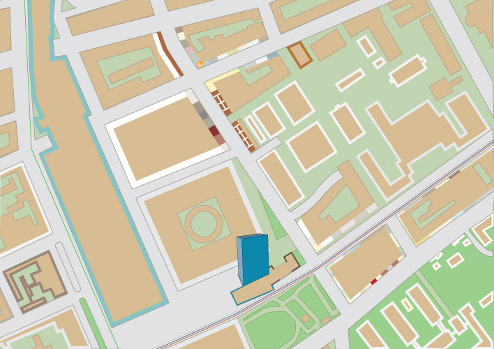
Using the stroke of buildings as an opportunity for representing house color which may be unique for every street.
CLIENT:
Personal Master's Work
PROJECT DESCRIPTION:
For a design research topic, I wanted to investigate whether physical paper maps could show orientation cues, eliminating the need for a compass. Today, less people use a compass for a number of reasons yet maps have not been changed to adjust to this. Without the use of a compass, the maps are less efficient, since the user cannot always gain orientation from their immediate surroundings.
In order to understand how maps could incorporate orientation cues, I studied images of streets and maps comparing their relationship. I noticed that maps show every street in the same visual language, as it makes sense for a information graphic to do. Yet, the images of streets were, of course, very different from one another.
If a map can translate a visual cue from the real world into a graphic representation for a map, these graphic elements can be used by the map reader to orient themselves. By making the maps more graphically specific to the city, they provide the reader with more visual information of that city.
SOFTWARE USED:
Adobe Illustrator