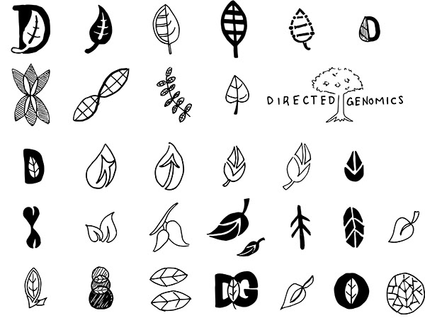
Directed Genomics is subsidiary company of New England Biolabs that uses genomes to research medical treatments. They were reaching the stages in their development that they needed a look to set themselves a part from New England Biolabs. The only hint provided was that sometimes when they imagined their logo, it had a leaf in it.
Problem:
Create a logo for a genomics company that does not use the DNA double helix. At the request of the CEO, they did not want the double helix in the logo.
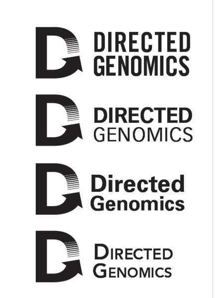
First Draft Mockups
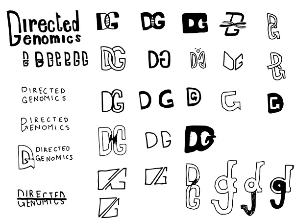
After exploring the leaf idea, I discovered that a capital D and G can be merged together in several interesting ways. A monogram is also a traditional and professional logo for a company dealing with such serious things as medical treatment. Ultimately the team really liked the use of the G being combined with an upward sloping arrow. This worked well as double entendre: the arrow was a visual representation of “directed” as well as the upward progress of genomic research.
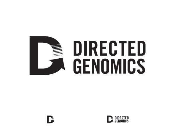
The client responded most to the D/G logo, but wanted more balance in the words "Directed and Genomics." For the second round of mockups, I provided options that addressed these wishes.
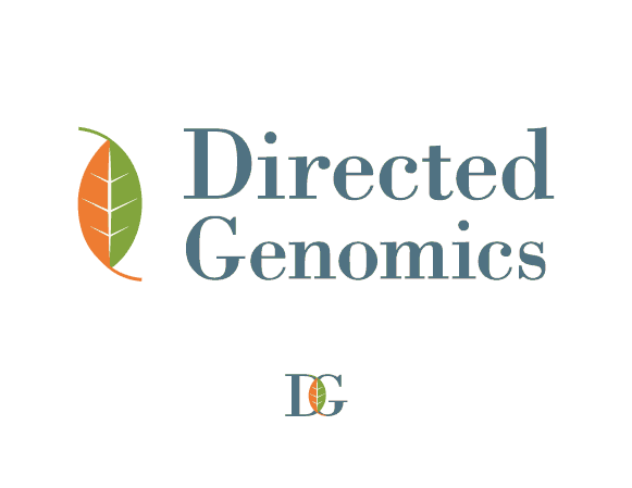
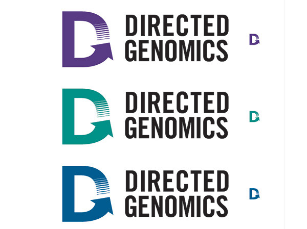
I also wanted to encourage them to chose an options without the gradient, because I believe it will cause difficulty later on if they were to embroider the logo on lab coats or screen print it.
Second Round of Mockups
3rd Round
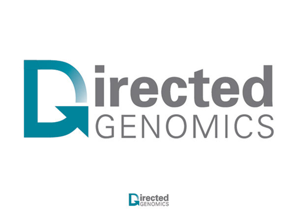
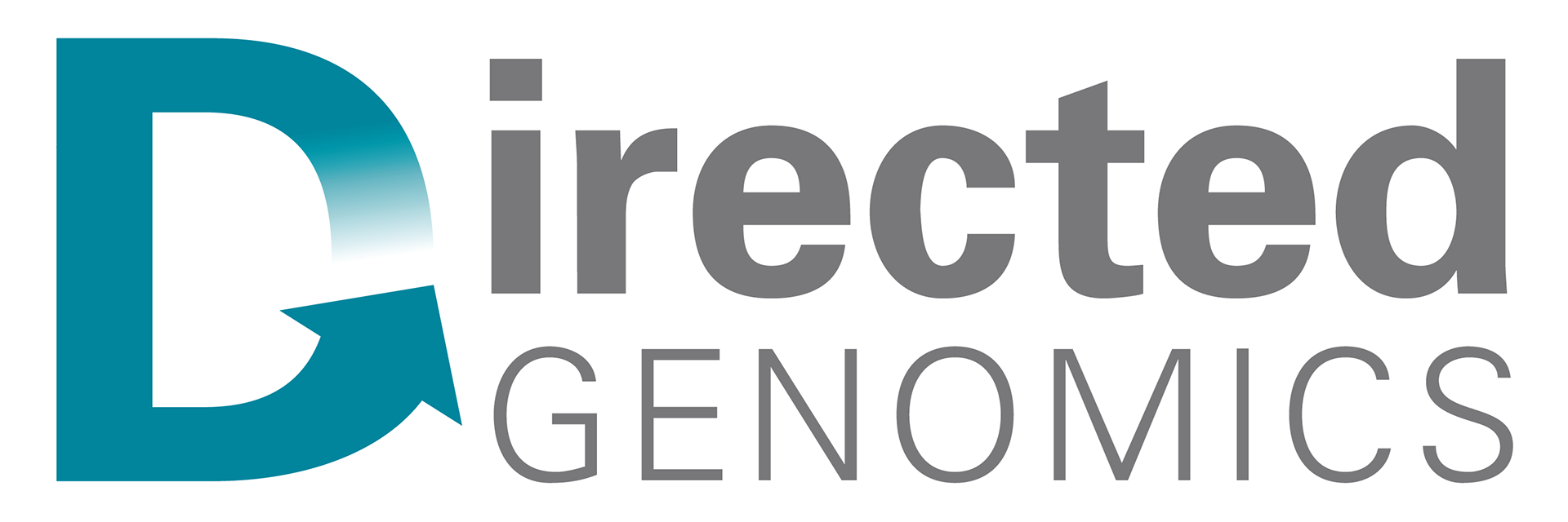
Final Logo
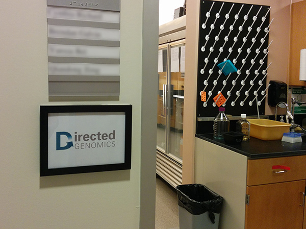
Logo outside the Directed Genomics Office.